Magazine Advertisement Insert
Do you hear the bells of Notre Dame and the quiet chatter of a calm cafe?
Paris is calling for you!
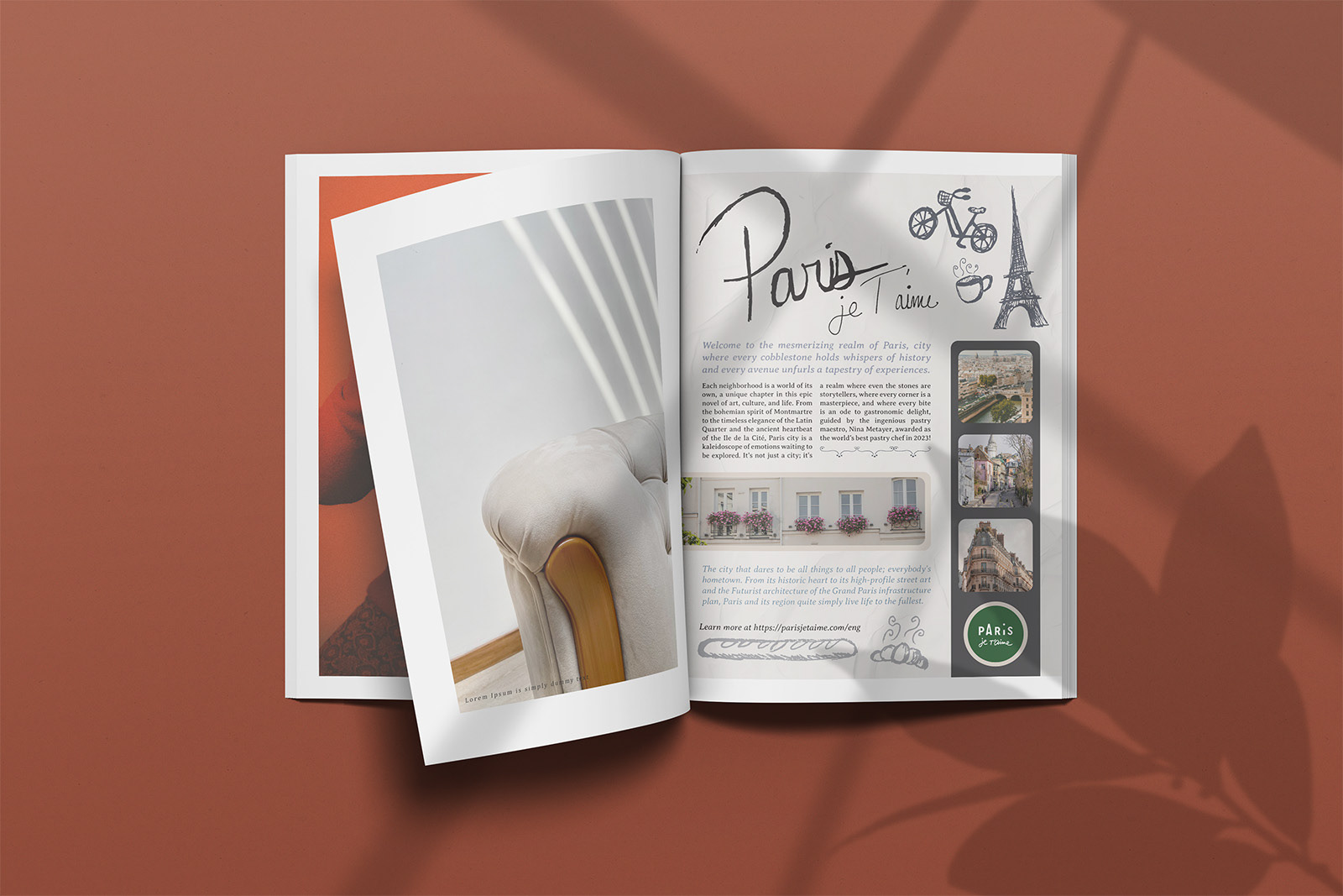
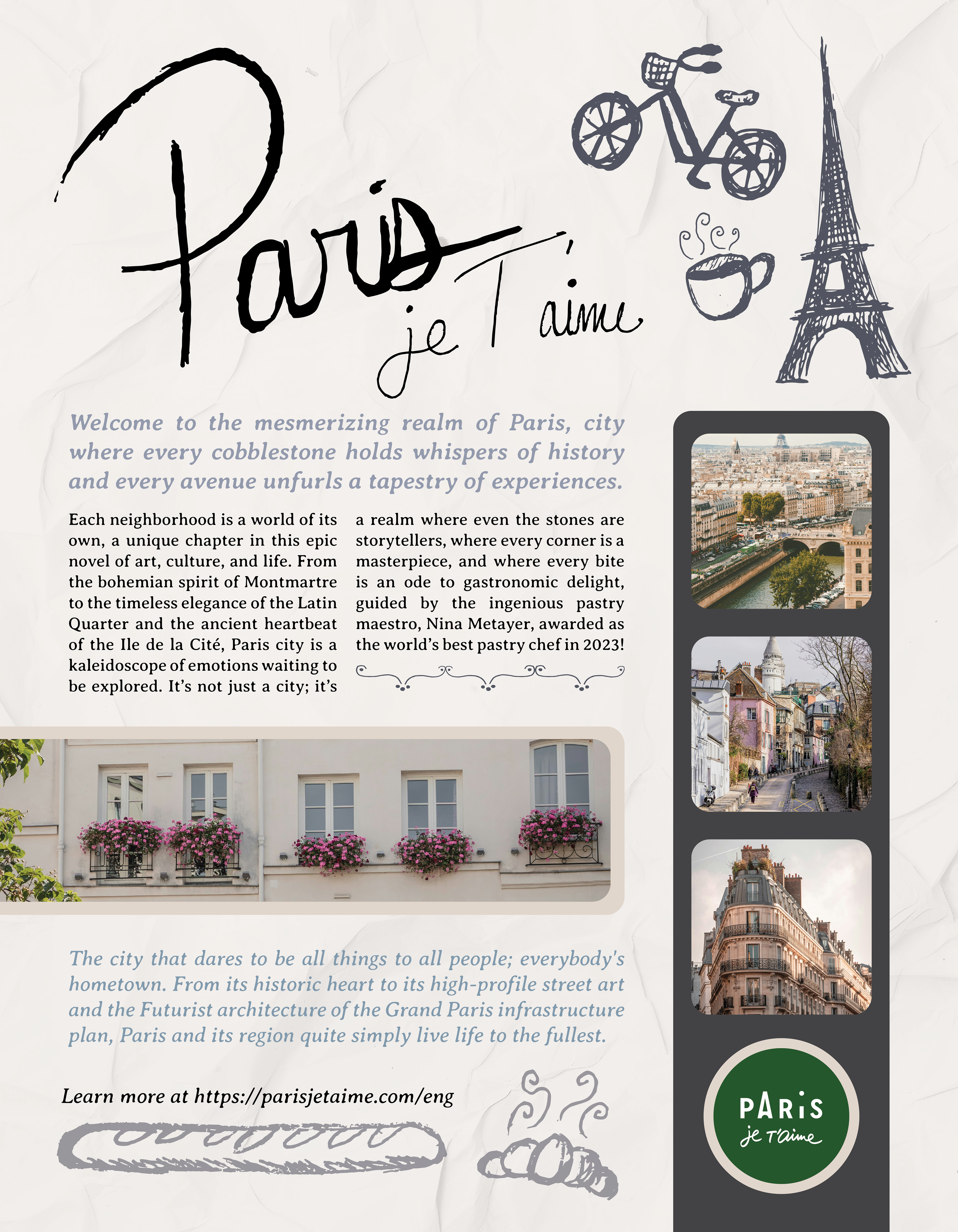
For this project, we were asked to create a travel website and magazine advertisement based on a place of our choosing. I chose Paris for it's chic, elegant, and vintage atmosphere -- I wanted to create that feeling in the project. I used paper textures and hand-drawn doodles to create a sketchy and vintage feel, while keeping the typography simple and elegant.
Skills Developed -- Illustration, Web Design, Mockups, and Print Graphics
Ideation Materials
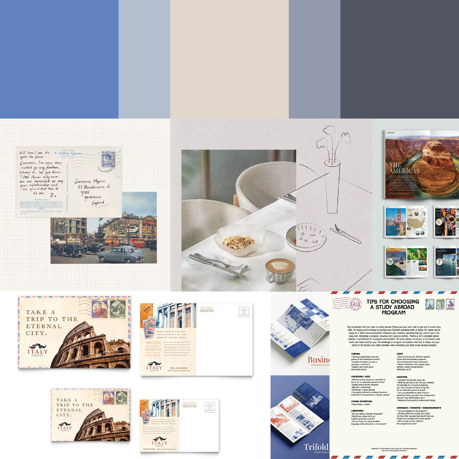
I created this mood-board based around the idea of making a travel-based set that has an elegant, but personal touch. I looked at a lot of vintage and simple design touches, as well as studying the colors used in the work. I loved the consistent blue and white color combination throughout this mood-board as well as the idea of having a fun sketch element added to it.
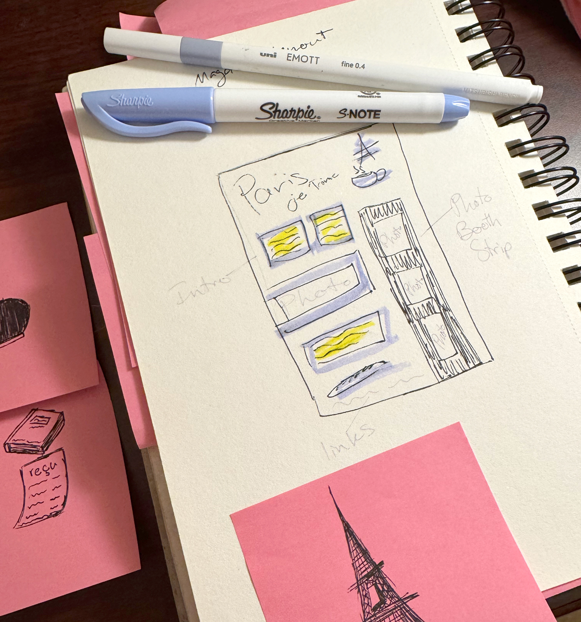
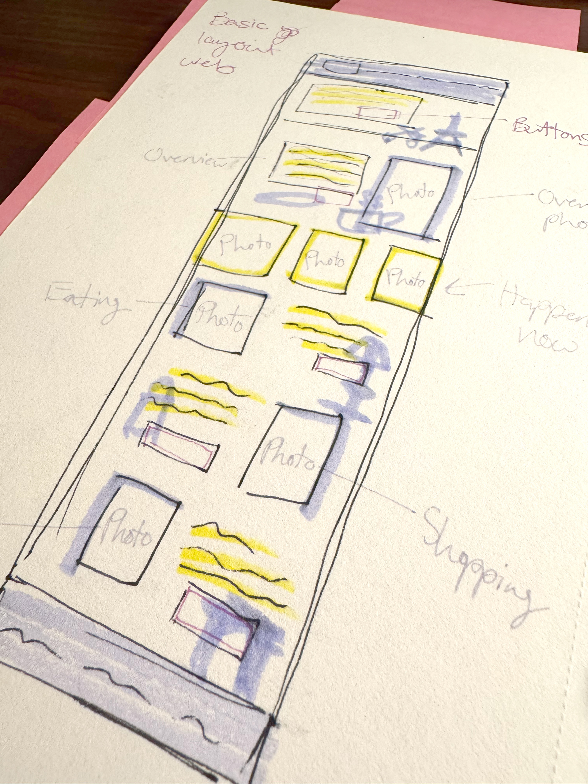
Sketching
I knew I wanted to create a fun flow website, while still keeping in touch with the aesthetics of Paris. I created small wireframes for both the website and the magazine ad. I also created a lot of rough sketches to be used as elements for each of the projects.
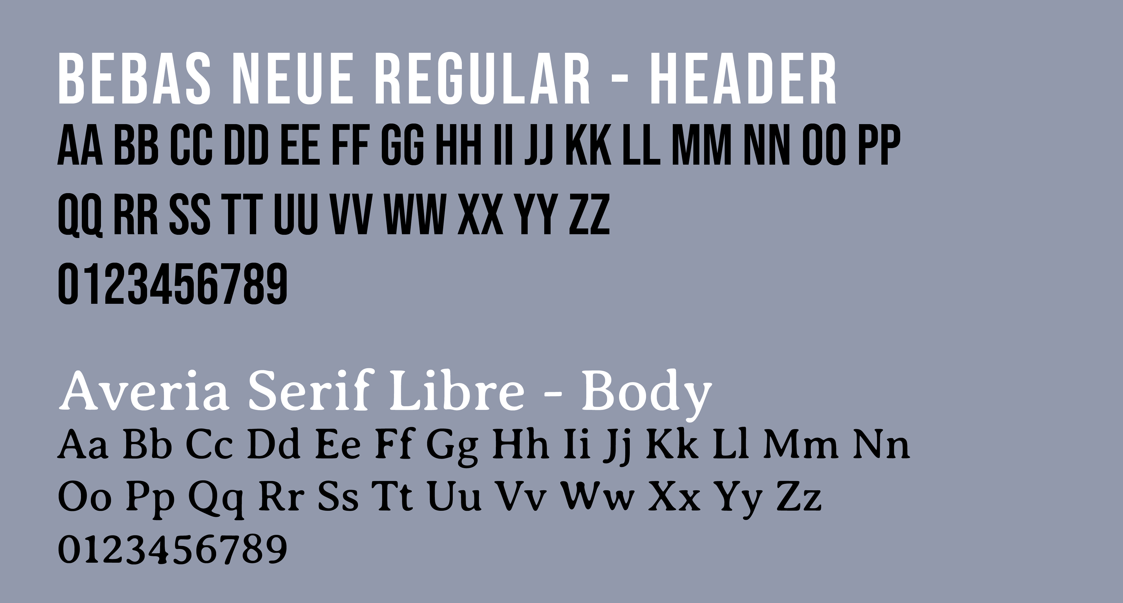
Typography
I wanted to make sure that the typefaces I chose reflected the newspaper-esc look I wanted in both the website and travel advertisement. I also wanted to have the 'Paris' travel "logo" to have the same sketchy quality I was giving the illustration elements, so I drew a few versions of it and traced the sketch to create the same look and feel.

Color Palette

Imagery and Elements
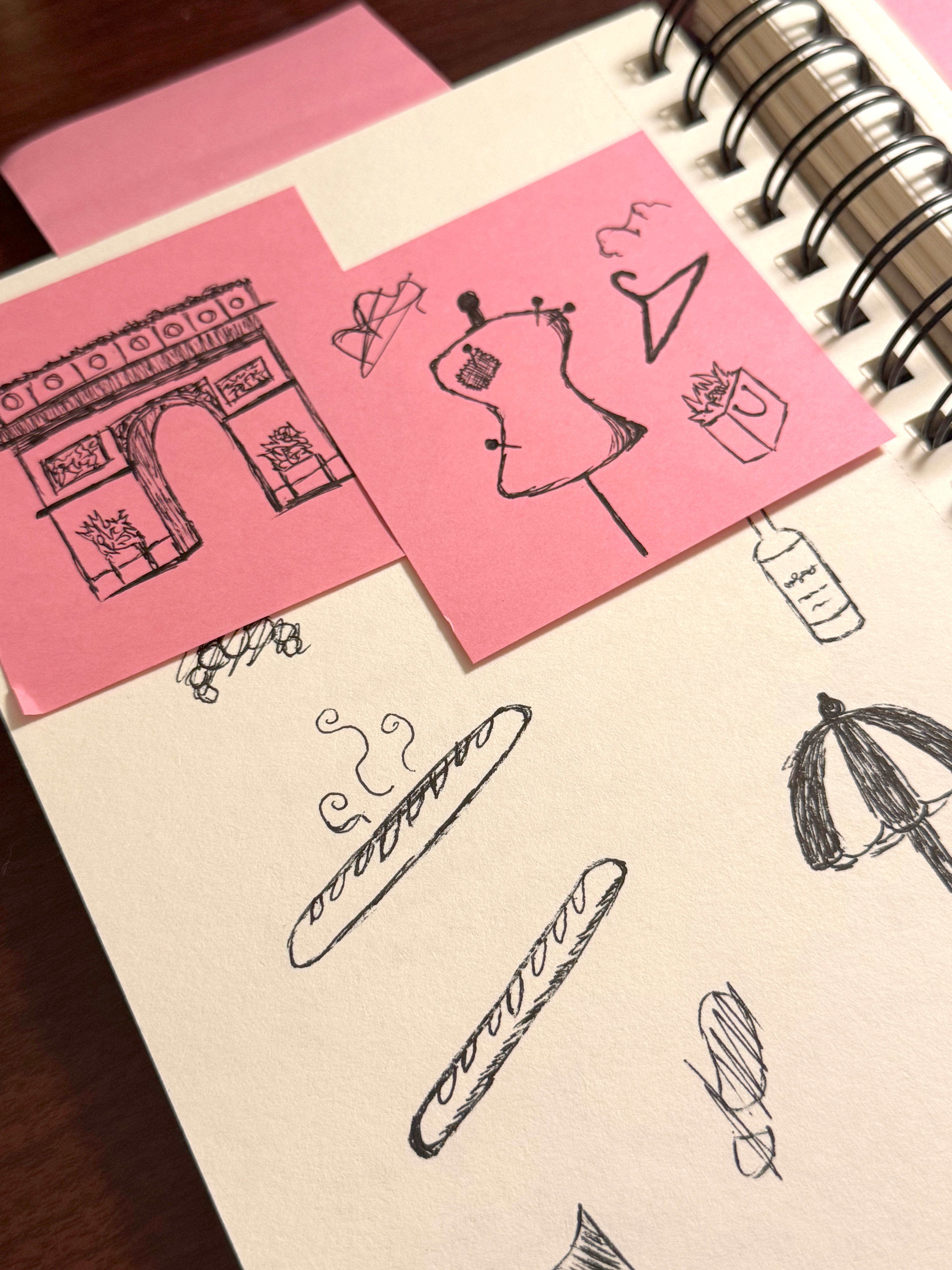
Each of these elements were sketched out and traced to be used digitally, I wanted to give the effect of a quick sketch as if drawn on a napkin while sightseeing, and highlight staples seen throughout Paris itself. This was really fun to adhere to the quick sketch format, and not have everything be perfectly drawn.


Final Thoughts
This project was a joint-venture between two originally separate classes and projects, the travel ad being from a graphic design course and the travel website being from my web design course. I decided to redo the individuals and create a travel identity package to learn cross-consistency, especially between print and digital work. I really enjoyed doing the research and visualization for both of these, I am proud of how they came out. Learning how to make stylized iconography and imagery was very interesting, and I will look forward to using these skills in the future for other projects. Overall, this project allowed me to learn more about cohesive design, and how it can truly be satisfying when it all comes together.